
Figma Mobile Project Editing & Sharing
Protoype Designer
Robert Kovar
Completed March 19, 2023
Jupyter
Problem Statement
Users need to be able to quickly edit and share figma projects on mobile devices without the use of a web browser.
Discovery
User Research
Goals
Our research goals were to understand what the common core issues that mobile users of figma run into, and how they interact with the app/expect to interact with it. This also includes the use of styluses/touch inputs.
Methods
To conduct our research, we used a mixed method approach of interviews and data science. My responsibility during this phase of discovery was conducting interviews. I interviewed UCSD undergraduate and artist Jordyn Shen. Jordyn uses a stylus for digital artwork and notetaking, but was unfamiliar with Figma. During the interview I focused on what features Jordyn thought made her stylus worth using, and what apps she thought made the best use of a stylus in an attempt to understand how an app can implement a stylus well. Due to time constraints, we conducted a total of three interviews, with a focus on finding users of Figma, and users of a stylus.
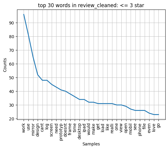
As for our data science research, we used a web scraper to pull all Figma apple app store reviews and imported the data into python. After processing the data into something usable, we then sorted the reviews by finding the most common keywords of reviews rated three stars or less in order to find common complaints about the app. After we had a representation of the common words, we narrowed down to specific words that appeared very common and seemed to be about pain points/missing features such as “cant” and “doesnt”. We made a graph of the most common words found in the negative reviews, shown below. Then, these words were searched for in each set of reviews so we could read the text in context to find out the specific issues, with relevant quotes from these reviews pulled for research.
Findings
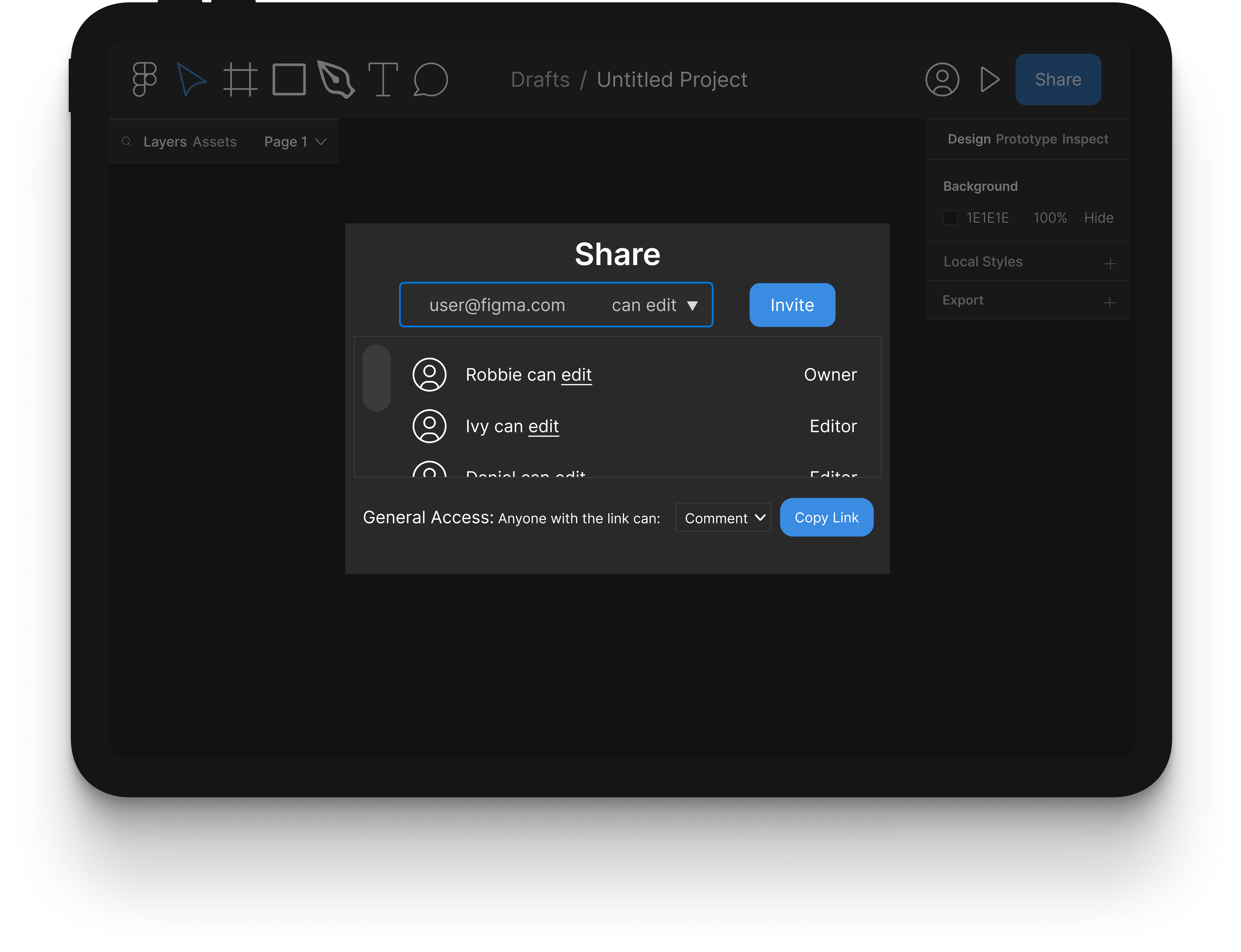
During our research, we identified multiple pain points. Research stylus users had issues with the precision and speed of drawing when using the parts of Figma mobile that have support. The Figma app users had complaints regarding the sharing feature in the mobile app, specifically that it has none. If a user wants to share files with others, they can only do it through the desktop app. This is a huge problem because one of the biggest upsides of using Figma is its collaborative features. A large amount of the bad reviews (3 star or less) took issue with the fact that Figma mobile does not afford editing Figma files. This is the main issue we are tackling through this project, and the mobile app users confirmed this problem, pointing out the obvious that there is no point to having Figma on a tablet if it cannot be used for editing files. Another pain point that emerged from the app store reviews was that there was no automatic aspect ratio fill for files that are a different aspect ratio than the tablet being used to view the file. Users are unable to zoom out and are instead forced to view their file in sections, having to scroll through to see each part.
The most common desire we found was also our most common pain point with the app. The ability to edit projects and run prototypes from the app is entirely absent, with multiple reviewers sharing their frustrations with the missing features. Below is the review quote that encapsulates the sentiment of Figma mobile users:
Competitor Research
For our competitor research, We focused on three products that provide a similar service to Figma:
Sketch
Sketch is one of Figma’s main competitors, providing similar wireframing design and prototyping capabilities. Sketch’s mobile app is also similar to Figma’s with basic viewing and prototyping features.
- Runs prototypes on mobile
- Does not support mobile editing
- Does not support sharing for collaboration
- Not stylus compatible
Mockup
Mockup allows users to create prototypes using their mobile devices. It has no desktop counterpart but has full stylus support and full editing capabilities within the app.
- Does not run prototypes on mobile
- Supports mobile editing
- Does not support sharing for collaboration
- Stylus compatible
Adobe XD
Adobe XD is similar to both Figma & Sketch. The mobile app cannot be used for editing, and is mainly for live preview while tethered.
- Does not run prototypes on mobile
- Supports mobile editing
- Does not support sharing on mobile, only on desktop
- Not stylus compatible
From our research we found that the features we set out to add to Figma mobile would make it a product unlike any other on the market today.
Design Process
Persona
As part of our design process we created a persona to provide more focus to our design.
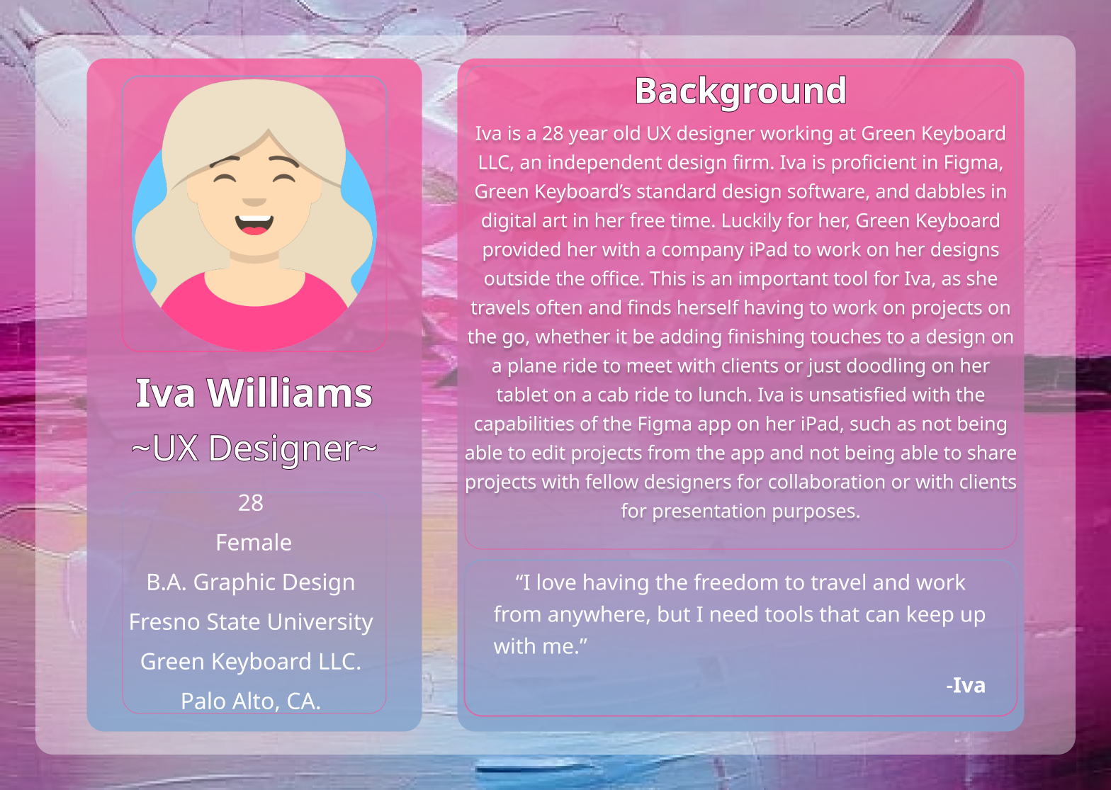
Our persona is a representation of a professional designer who is already proficient in Figma. Iva knows her way around the desktop app and her ideal mobile app would be one with the dewign and all the features shes familiar with but optimized for a mobile device. meaning a smaller touch screen. Our prototype focuses on meeting her needs.
Sketches
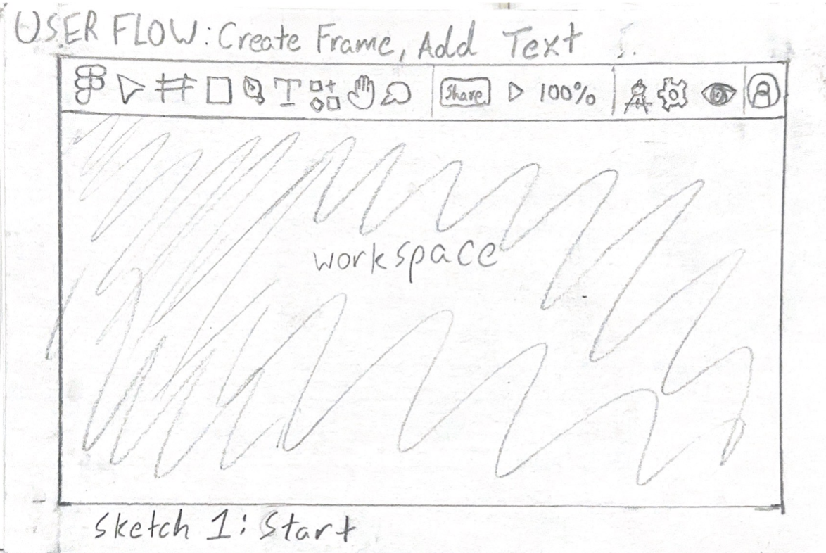
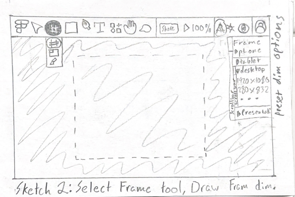
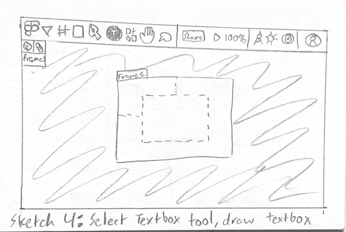
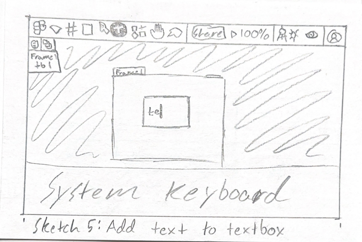
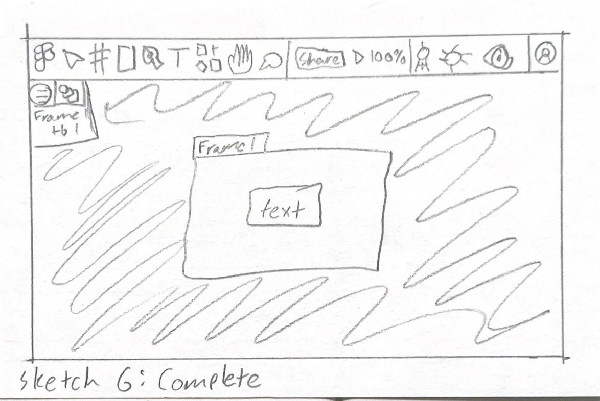
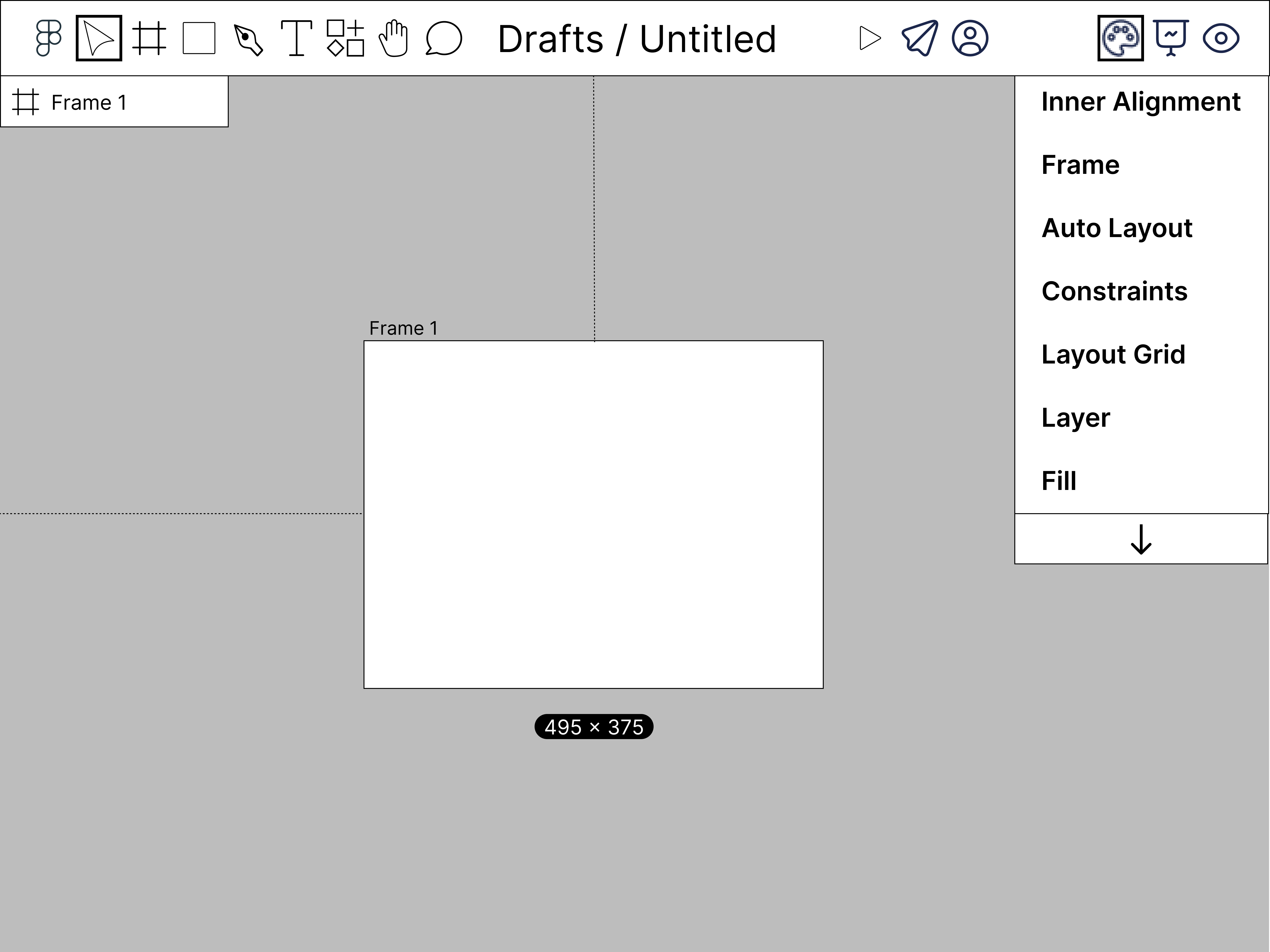
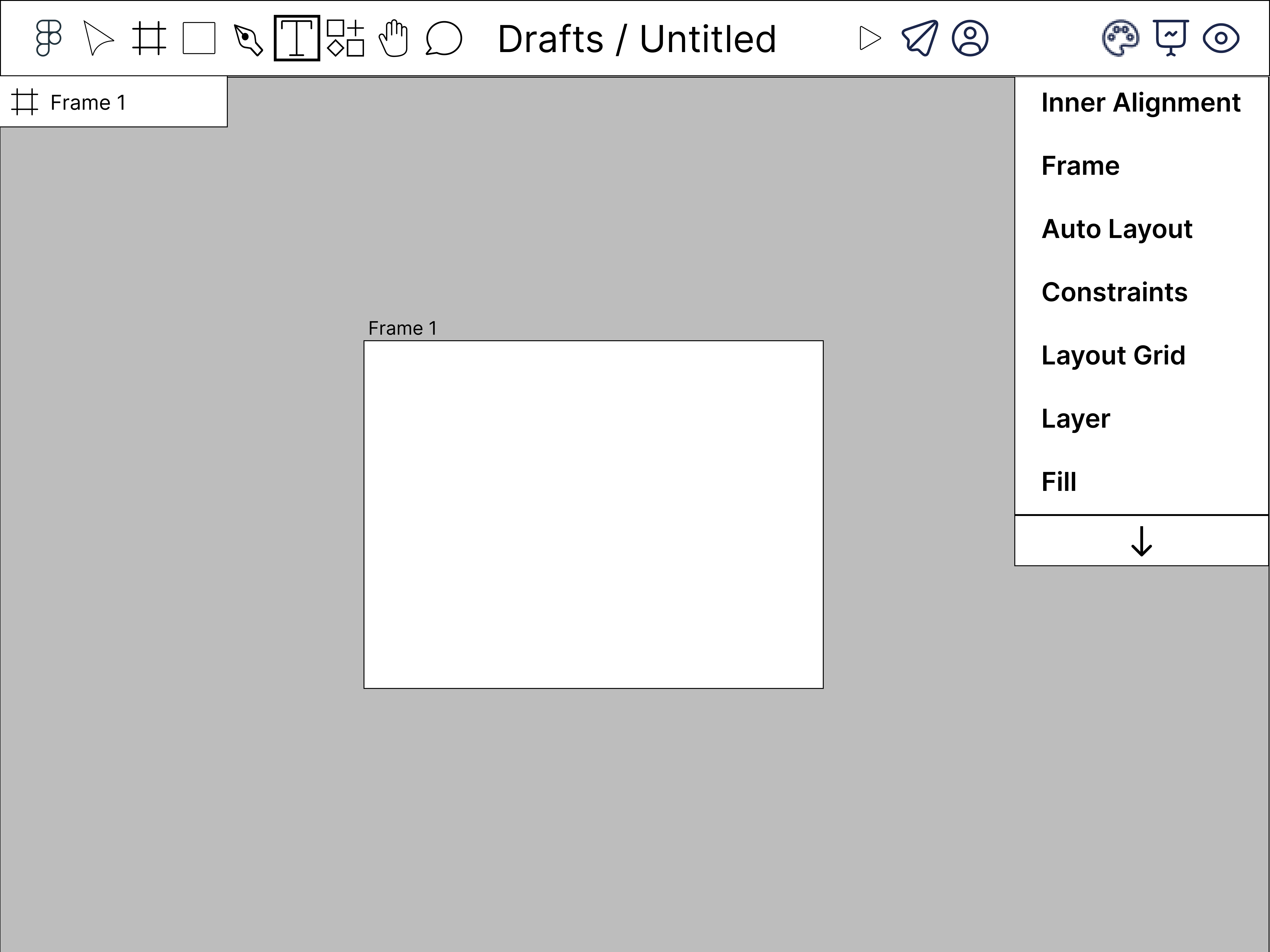
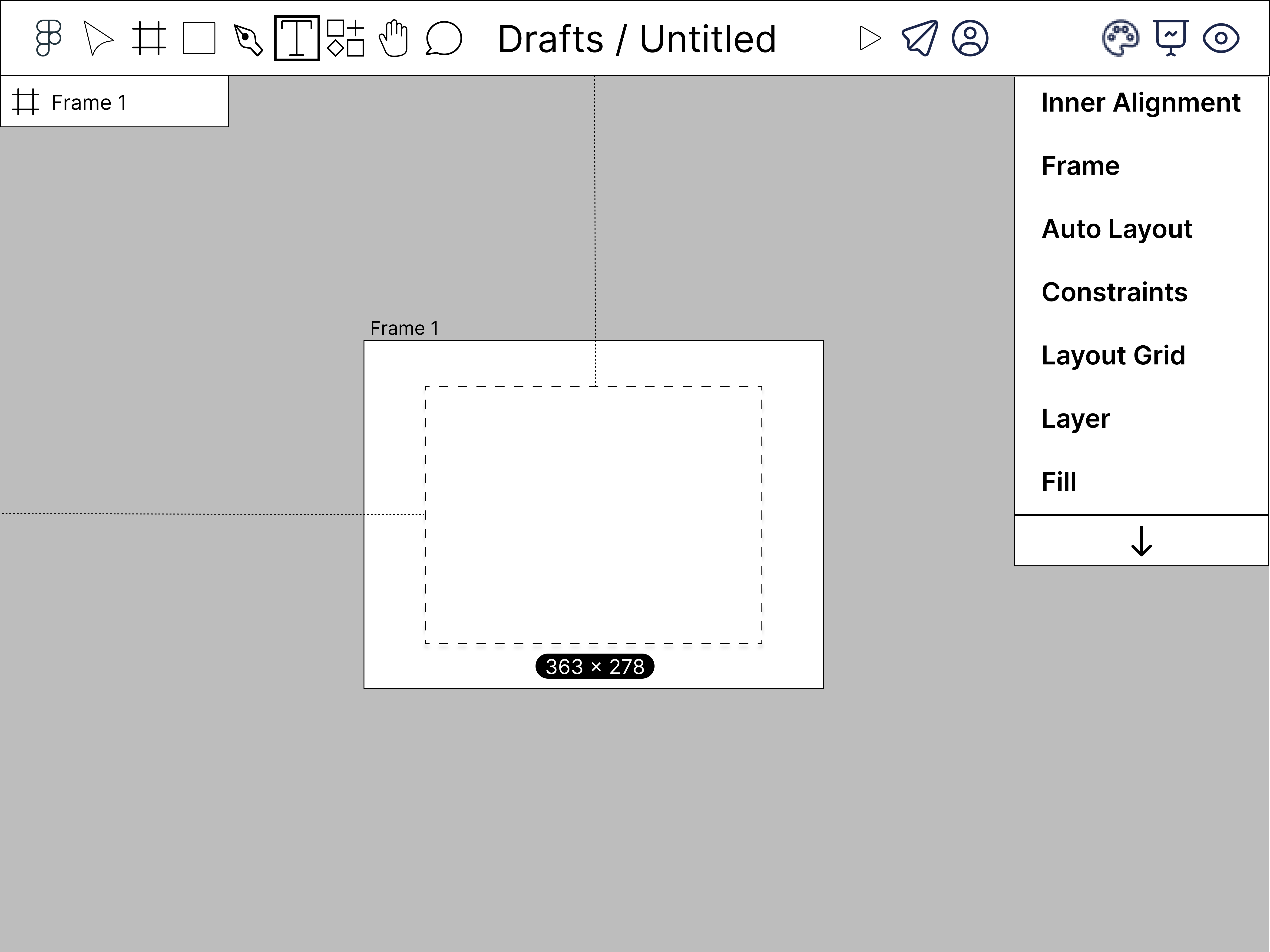
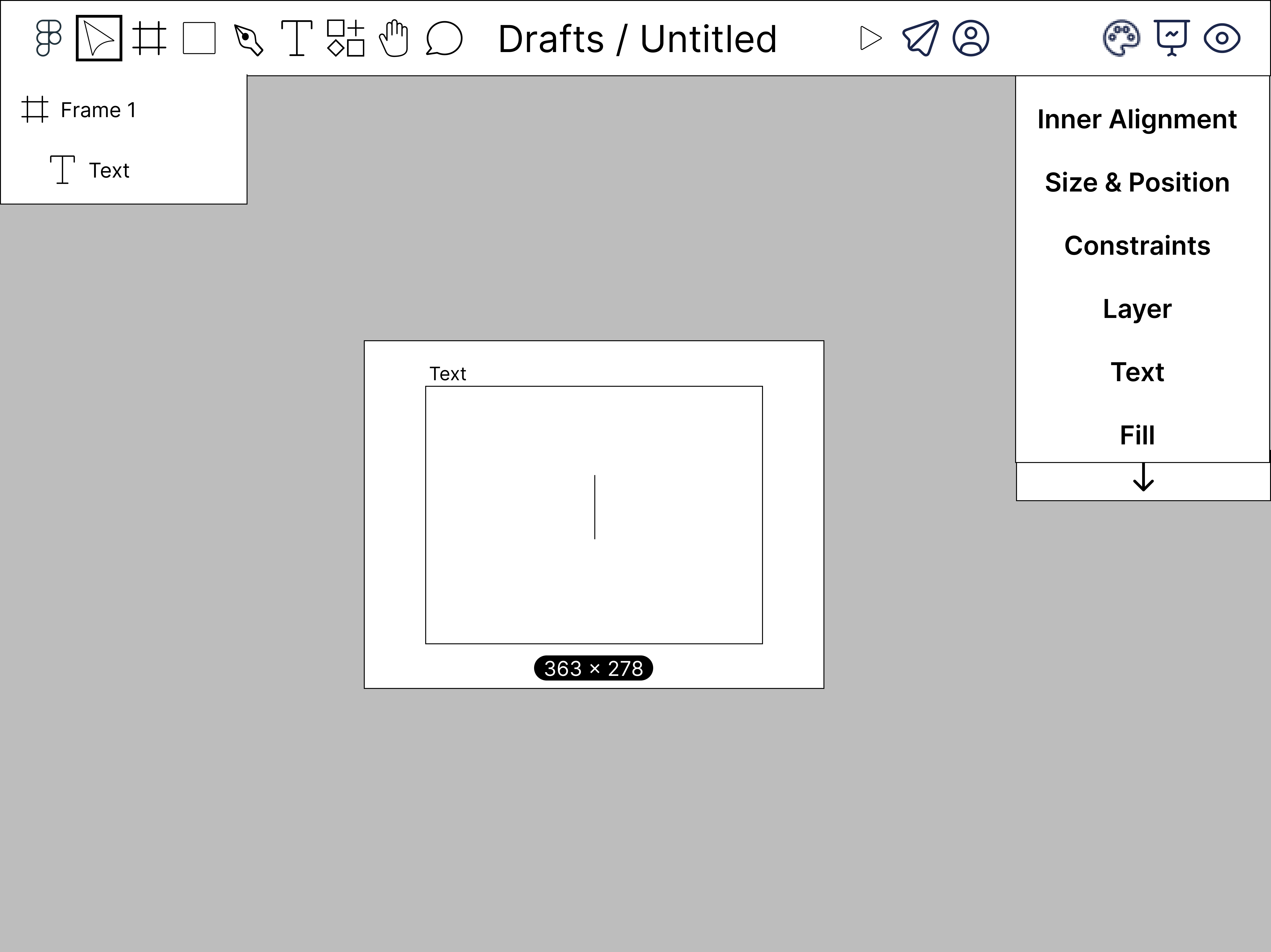
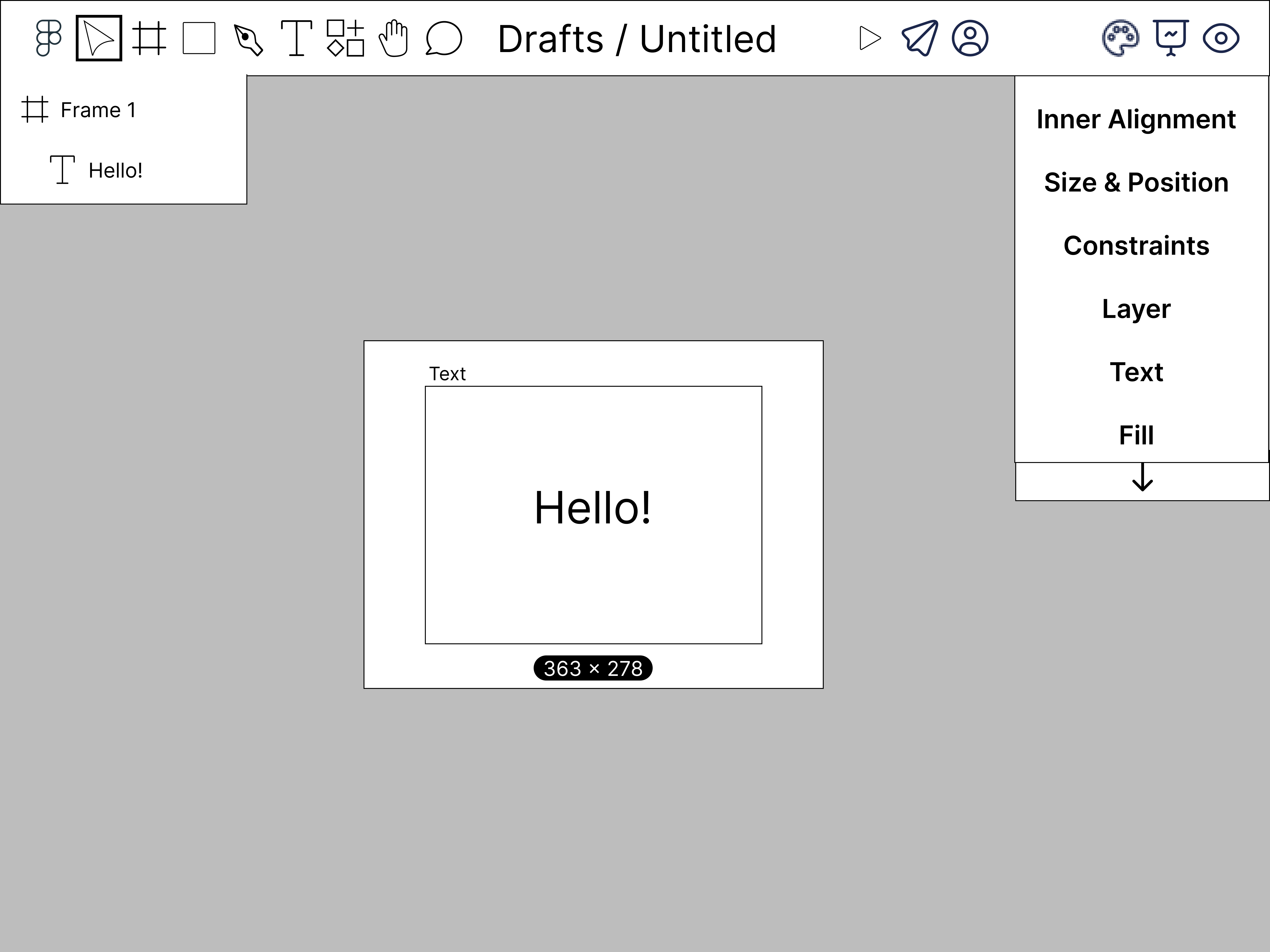
During the prototype design process, I was responsible for creating and improving our prototype depicting a user creating a frame and adding text to it as an example of how the mobile editing UI would look in use. When creating the sketches, I took heavy inspiration from the Figma editing UI with the intent of making it as close to the original as possible. Despite this, I did make a few changes in order to try to optimize screen space. Instead of writing out the names of the three tabs on the right sidebar (Design, Prototype, and Inspect), I chose to use icons that represented the tabs. Another optimization is the length of the sidebar. I chose to shorten them as much as possible to save screen space and mad them scrollable to deal with the amount of content the sidebars can store. The design choice I made was that of excluding the names of tools in the dropdown menus to fit with the theme of using iconography when possible to reduce the amount of text.
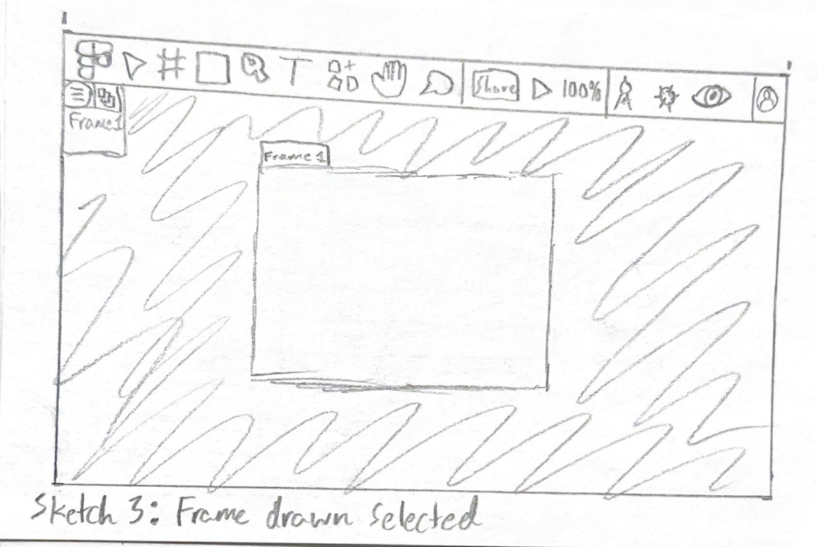
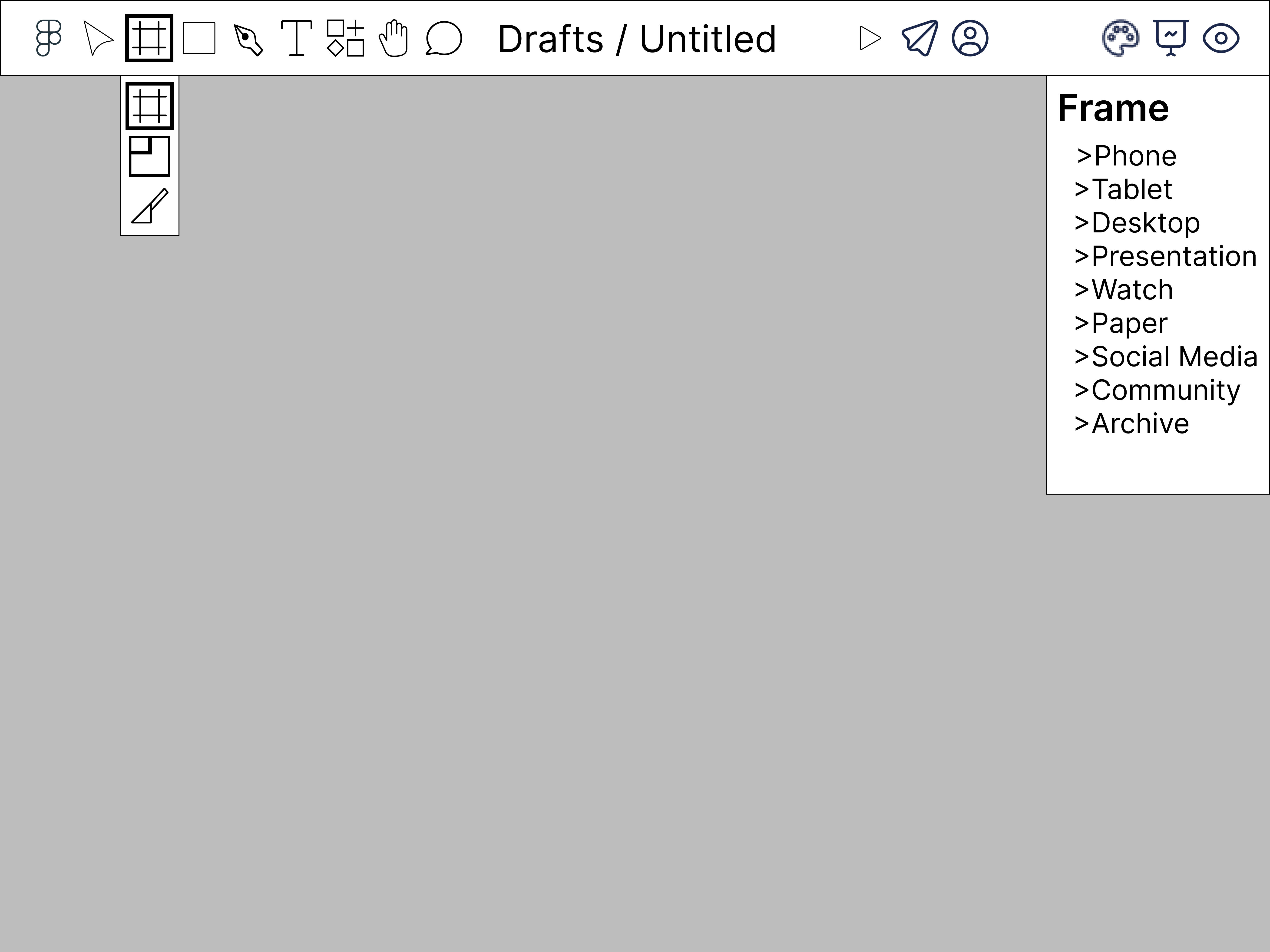
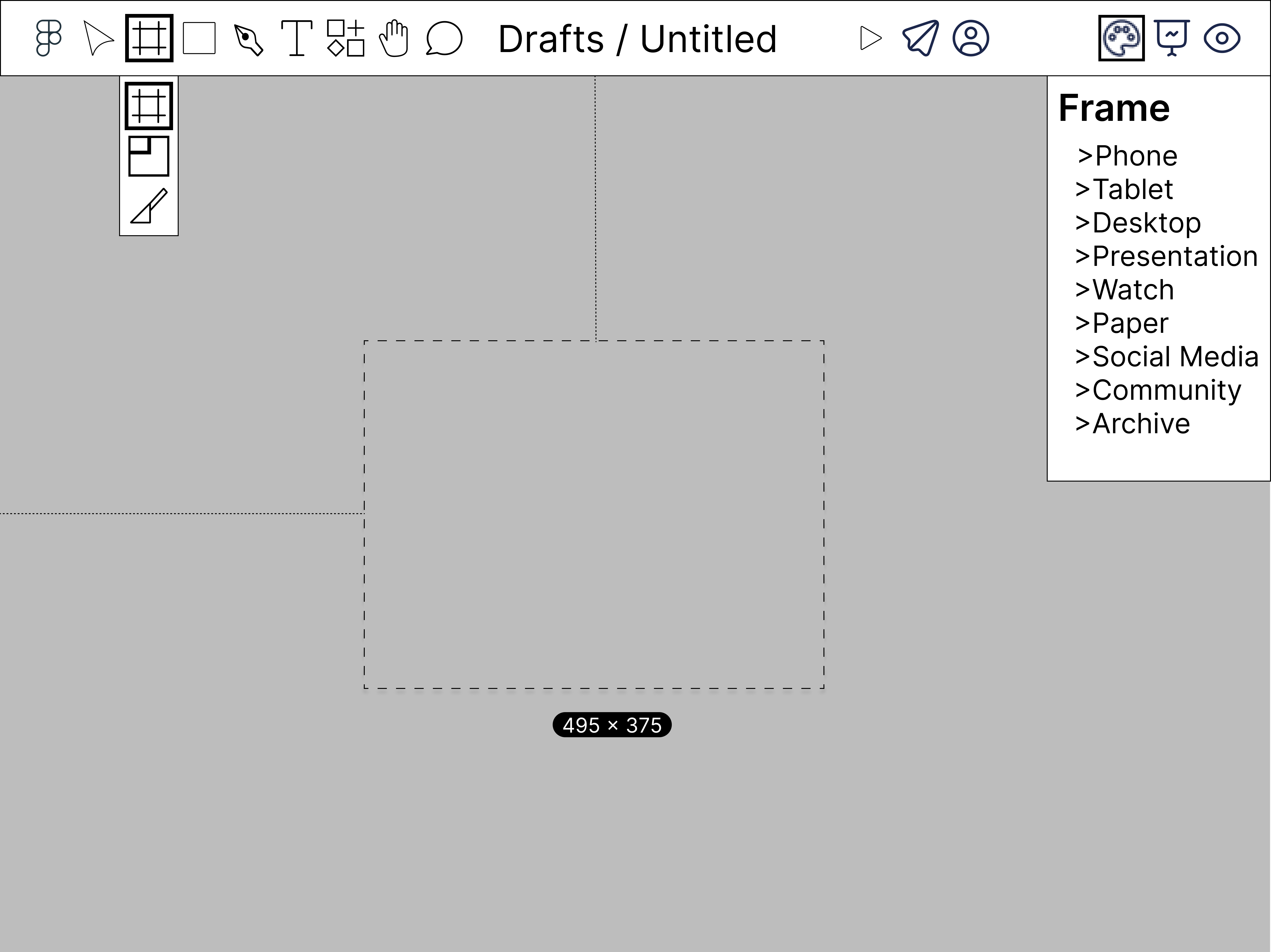
Low Fidelity Prototype
Our first prototype of the "creating a frame" flow is an almost 1:1 model of our original sketches. The only changes is the use of different icons representing the right sidebar tabs. For design, I changed the icon from a compass to a palette. The prototype type changed from a gear to a projector screen. These changes were made to better represent the function of the tabs.
Testing
From peer feedback and limited user testing, we were able to collect valuable insight into our low fidelity designs. Our main issue was that users not familiar to the Figma UI found the the icons to be confusing. Although our focus for the original design was a user like Iva who is proficient in Figma, we believe that the product must still be intuitive to new users.
Improvements & Final Design
Final Design
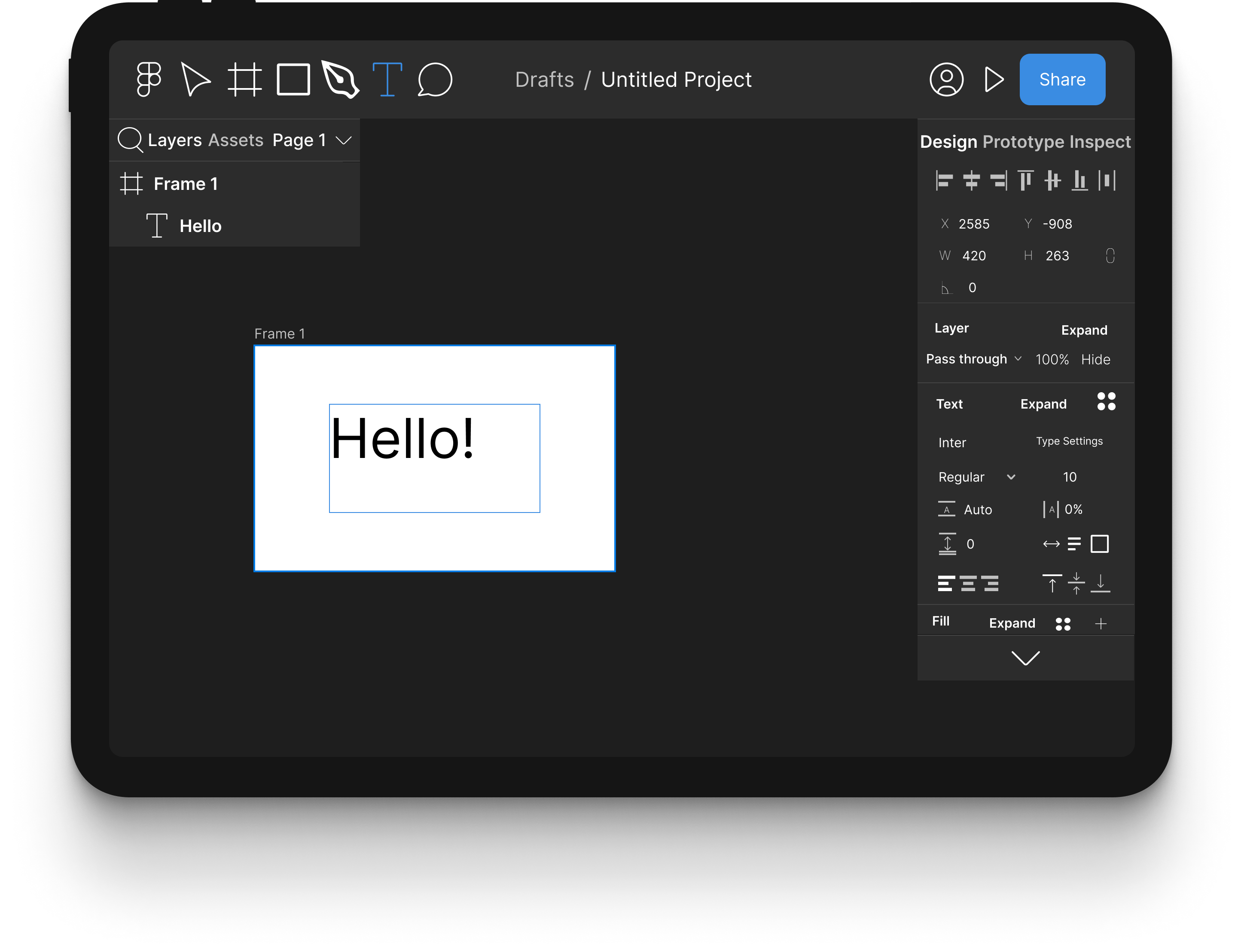
The final design is simliar to the low fidelity prototypes with a few changes. The biggest is that of the expand button. The UI was designed to be used with a stylus, but not every user will have one available, and some of the settings section in the right sidebar are too small. The expand button fixes this issue by allowing the user to expand the section, allowing easier view and use of the individual settings menu. Another major change is the reversion of icons to normal titles of the right sidebar tabs. User testing found that new users thought the icons were confusing, and experienced testers are already used to the text titles.
Outcomes & Next Steps
From this experience I learned how to use figma and gained experience through designing a product meant to be an extension of an existing app. I also learned the process ofcreating a website from hosting to designing. Finally, and most importantly, I gained valuable insight into the process of doing a design case study. The process was compressed into a ten week period, but if I had more time to put into imporving the case study, I would put more time and effort into user and competitor research. From this experience I believe the discovery phase to be the most important step for designing something worthwhile and creating a case study that will impress potential employers and anyone who reads it.